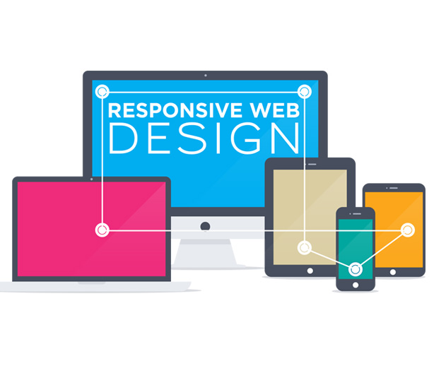
Responsive Web Design
Responsive Web Design
According to the researches all around the world the use of cell-phones and tablets has increased marginally. Because of this websites are being consumed away from the traditional computer more and more. It has become more essential now, more than ever, that website owners respond to this trend and ensure their website is capable of displaying properly for each device. Google also indicates that it will serve different results to users searching on mobile devices, and you should earn extra points if your content is ready to be served to these mobile devices. Also, users are consuming websites in a different way now. Not all mobile users are "out and about", and looking for information. Research has shown that they are actually replacing laptops/desktops by browsing on their iPhone/iPad while in front of the tv, on the bus, in the office, etc. There are some industries that will adapt to Responsive Web Design much quicker than others but eventually all websites will have a responsive design, as it will simply not be possible to ignore this trend. The faster you adapt to Responsive Web Design, more traffic you get on your site.
Benefits of Responsive Web Designing
SEO: Recently, Google has gone out and said that they prefer sites that are responsive (as opposed to having a separate mobile site for the same content), as there is only one address for them to serve the content for, to the user. You also have more of a chance of your content being served to users searching on mobile devices, compared to non-optimised sites. Cost - To maintain separate device specific websites (e.g. for iPhone, iPad, Desktop) would be more costly than maintaining one single website that's layout adapts automatically to the device in question. Users - With a well designed responsive website, your users will be happier to use your website and return again and again, on their alternative devices. If a user can't use your site efficiently, as it is not set up to work on their device, it's unlikely they will keep returning. Competition - As RWD is in its early adaption stage, getting a leg up on the competition could gain you extra customers and sales. Your new responsive site could appear ahead of your competitors in Google searches, and nobody will turn that down. Future Proof - By going responsive, your website will stand a much better chance of standing the test of time online. If you get a site designed today, and don't refresh the look for another 3 years, even if new devices are announced in that time, your site should have no problem being displayed in its adaptive layout
Overview
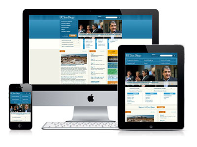
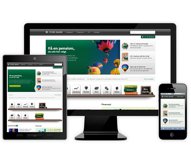
Today, websites are being consumed on a variety of devices; not just the traditional desktop computer of yesterday. Now, users are visiting websites from their phone, tablet, TV, games console, as well as their laptops. We need to adapt to the change in size and variety of devices that are on the market, and being released every month.To handle all these devices, the latest technique of Responsive Web Design (RWD) is being employed more and more, especially over the traditional method of creating a separate desktop site and mobile site. Google has announced that it prefers to see sites work responsively as there is only one single page for all contentThe process of responsive web design works by making the website expand and contract based on the width of the browser in question. This can work on all devices including iPhone, Android, iPad, small laptop screens, and large desktop screens.